Adios Amigos! Ahemm, so where do I start from? Oh, unless you’ve been living under an egg-crate you pretty much have seen a very peculiar smartphone design which seems to have found its way onto the form of every current flagship device.
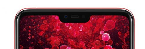
Let’s have a brief look at where this may have stemmed from. At a quick glance, it appears to me that someone in R&D of your favourite smartphone company may have stumbled upon this after a part of the screen was left on the floor of the cutting room during the design process. The result might have been oddly satisfying and this was translated onto the final product because, well it could be something to keep ideas fresh in the design department. Mind you that tech companies are plagued with this a lot. On the other hand pay no attention to my theory. That’s just something l fantasized about while writing this article.
Now the real question is can we find the birthplace of the notch and perhaps those who came up with the idea? Maybe and maybe not, but let’s connect the dots to something I believe gave way to the silly cut-out on every smartphone screen nowadays.
Origin Story
Ahemm once again,….
So not long ago smartphone companies sought to make their devices bigger but less clunky to hold. Phones like the Sony Xperia XZ2 and even our beloved Pixel 2 could pass for a ping-pong paddle if one was hard-pressed enough for that necessity. The amount of screen space stolen by the “chin” and “crown” of these phones leaves little of the actual screen to look at. This feels like some kind of needless moat around the screen. Wait, so how was this problem going to be eradicated and make more room for our viewing pleasure? The bezel had to go the gallows folks! That gave birth to the screen real estate business as we see and love it today.
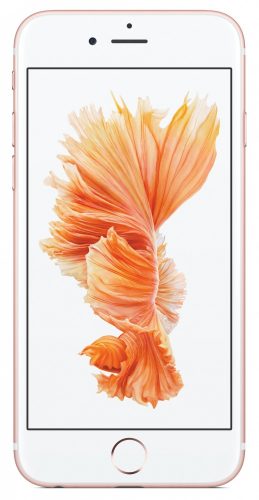
There are many concepts for a truly bezel-less phone. The main idea is to relocate the camera other sensors to somewhere less distracting on the phone. A lot of designs came and went but arguably the first and best example of this was the Essential Phone.
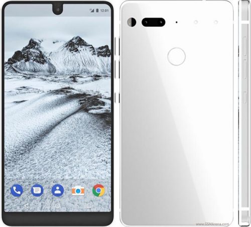
The Essential Phone managed to achieve a screen-to-body ratio previously unattained through one simple design novelty; the notch. This 84.9% screen to body ratio on a 5.71 inch display was the closest mankind brought the bezel to extinction. The sensors were rounded up in a small cut-out at the top of the screen. The camera was conspicuous making the phone look like a Cyclops of some sorts. This was new and in away looked stupid. But hey, if it looks stupid and it works, it ain’t stupid. The resulting form factor was the phone was less chunky with more beautiful screen to look at.
Lo and behold Apple introduced the iPhone X in 2017 and this was notch your regular-looking iPhone. The sensors were grouped at the top of the screen and just a quick glance at it unlocked your phone. Given Apple’s reputation for regurgitating the not-so-cool into the fanciest things ever this caught on really fast. It basically printed more money for the company and shot their sales spike several notches up into the smartphone stratosphere. Since then almost every major smartphone maker has said Danke, gute notch to other possible innovations and welcomed the notch into their boardrooms and factories.
Psst: forgive my endless fascination with the word eh, it comes to me notchurally .




Luv that bro